Groxten
Client: Groxten
Industry: Commerce
GroXten exists to bridge the gap between technology and commerce, creating value-driven solutions that connects businesses with customers, with every innovation designed to empower businesses, enhance user experiences, and revolutionize industries- one step at a time.
01
Problem Statement
Groxten, a multi-subsidiary brand, needed a cohesive visual identity that could unify its diverse business arms and communicate its core value- growth.
02
Goal
To create a strong, scalable, and symbolic identity that reflects Groxten’s vision of continuous growth and expansion. The brand identity needed to be flexible enough to represent multiple subsidiaries, while remaining recognizable and cohesive as a parent brand.


03
Design Rationale
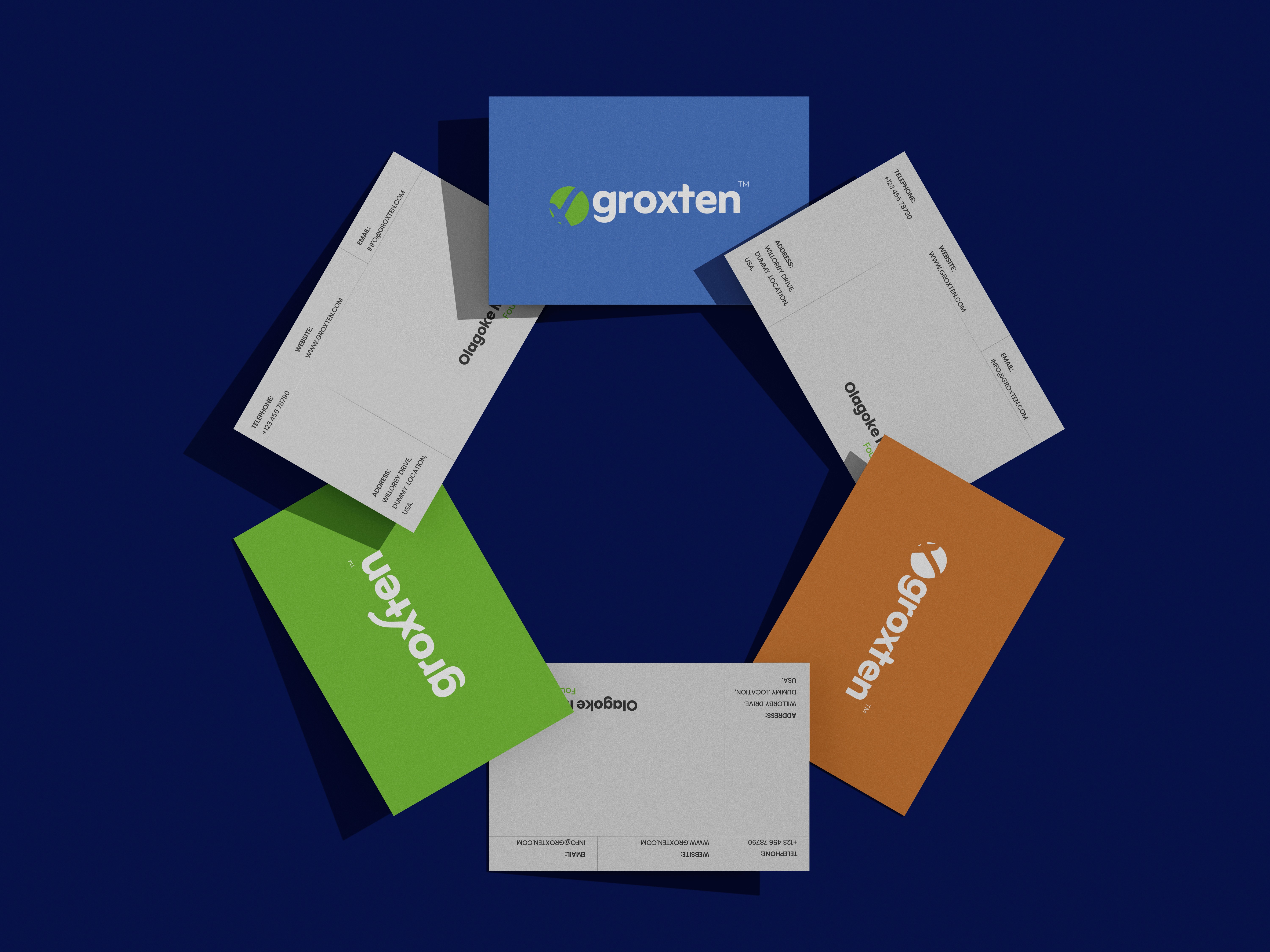
At the heart of the Groxten logo lies the ‘X’ with an exponential growth curve, symbolizing accelerating progress and limitless possibilities. More than just a letter, the design is a strategic visual representation of rapid growth, expansion, and forward movement, which aligns with Groxten’s business vision.
The precise angles and structured form of the ‘X’ create a sense of momentum and innovation, reinforcing Groxten’s commitment to bridging businesses and customers through technology. This subtle yet powerful visual metaphor encapsulates the brand’s forward-thinking approach, ensuring that every interaction with Groxten is a step toward greater expansion. With no defined brand system or scalable design language in place, the brand faced challenges in presenting a consistent and recognizable image across its ventures.nd success.
The brand’s color palette- blue, green, and orange- adds depth to this identity:
Blue symbolizes trust, technology, and reliability, reflecting Groxten’s commitment to stability and seamless digital integration, and, Green represents growth, prosperity, and sustainability- aligning with the brand’s vision of helping businesses thrive and evolve, and Orange conveys energy, innovation, and approachability, showcasing Groxten’s bold and forward-thinking nature; all essential values for a parent company overseeing various subsidiaries.
Content

04
Brand Pattern
The Groxten brand pattern is a visual extension of the logo’s core philosophy, representing growth, connectivity, and continuous progress.
The repeating curved arrows symbolize momentum and transformation, echoing the exponential growth curve found in the logo. Additionally, the pattern is inspired by two hands exchanging value, reinforcing the idea of businesses collaborating and scaling together.
The rhythmic and dynamic arrangement of the elements creates a sense of movement and forward-thinking energy, aligning with Groxten’s commitment to driving businesses toward new heights.


05
Result
Used with a clean, minimal, and modern typography, the logo serves as a timeless and premium brand mark, embodying growth, connection, and transformation at every level, and ensures the logo remains professional and adaptable across industries.